

Out of every 100 customers that visit an insurance website, less than 80 of them fill out a form for a quote (if you’re lucky), 15 reach the policy form-fill stage, and only 2 to 3 sign up for a policy. A 3% conversion is alarming, but that’s the ground reality.
State of Insurance Marketing
The insurance stalwarts in the space are all legacy players who prefer to market traditionally with minimal or obligatory tech intervention. On the other hand, the new-age customer-focused digitally savvy insurance brands gun for a richer user experience to drive traffic and educate users for increased conversions with a data-backed funnel-centric approach.
If the North Star metric is to boost policy registrations (aka revenue), then insurance companies must take a closer look at one’s website. It is the one touchpoint that substantiates the user’s intent for the product.
A staggering 59 insurance companies are vying for a juicy piece of the pie. They all have websites. Some exist for namesake. Others – the winning ones, exist to educate users, save time, and provide delightful user experiences.
The obvious next step is optimizing your brand website.
Optimizing websites is like creating playlists.
Optimizing a website is a lot like curating the right music playlist – you need to put together a collection of what works best and personalize that collection based on user behavior. If done well, both can keep users engaged and can hold a user’s interest and attention.
How so?
For example, if a user doesn’t move beyond the first two folds of a website, then having the core messaging and the CTA in those two folds would get them to click. Similarly, curating a playlist with jazz and rock songs for a user who only listens to those two genres would resonate with them and pique their interest.
But doing so could mean either going back to the drawing board or tweaking to find the right setting.
There are two things to bear in mind:
- Conversion Rate Optimization (CRO): The percentage of users who take a desired action on your website.
- Website Funnels: A sequential series of web pages to capture and analyze user behavior from an entry point to an exit point.
Mapping the user journey across your website and measuring leakage at each stage is funnel analysis. Taking steps to ensure they move as intended is Conversion Rate Optimization (CRO).
Here’s how they work – Picture a funnel. Yes, an actual funnel.
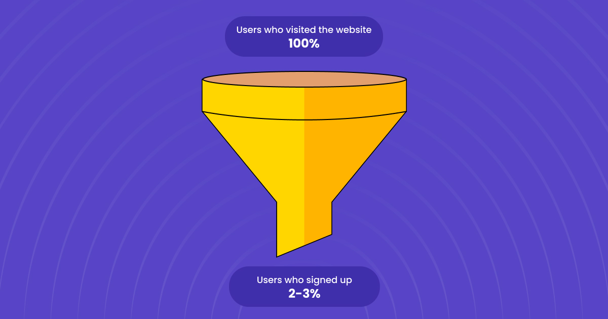
At the top, you have users visiting your website. At the bottom, you have users making purchases. The middle of the funnel, however, can and will spring a leak that causes users to drop off your website.
The drop-offs happen for a variety of reasons – from a complicated user interface to a lack of personalization options. The key is to understand where the customer is losing interest and address that pain point.
Let’s study two websites side-by-side step-by-step.
Step 1: Landing Page.
People do judge a book by its cover. A landing page can make or break your user experience.
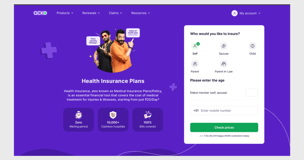
Website A
Here’s the website of Acko – a new-age insurance provider. Let’s call them Website A.
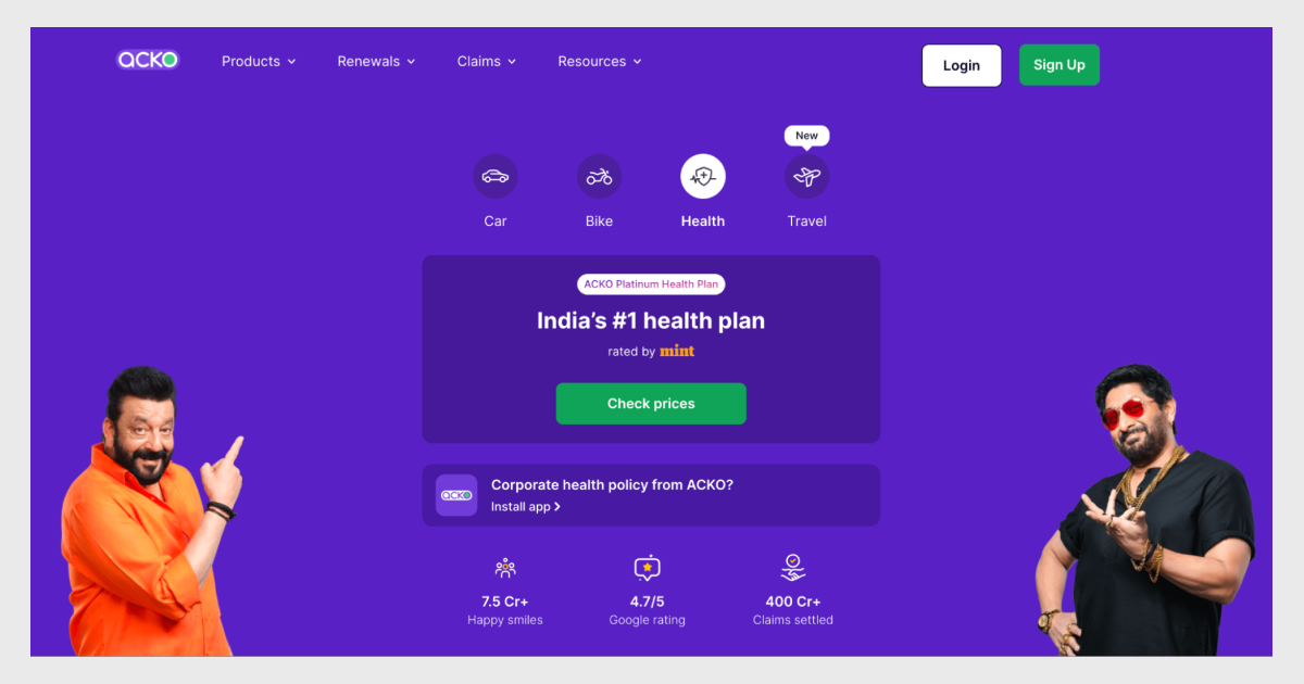
What’s right?
Website A’s interface is clean, and its messaging – clear. The landing page presents the user with a wide range of avenues to advance the user journey. Note how it not only highlights the Sign Up & Login buttons to boost registrations but also validates the brand’s credibility with a Google rating of 4.7 out of 5 displayed where it catches the eye.
These are some clever tactics to establish trust and invoke curiosity in the users’ minds.
Website B.
On the other hand, we have the landing page of a legacy insurance provider. Let’s call them Website B.
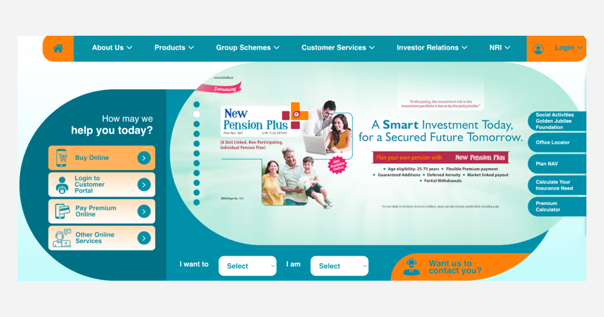
What’s wrong?
There is no flow nor any distinguishable Calls-To-Action (CTA). The landing page is riddled with options, just like Website A, except it’s not as structural and strategic. A website cluttered with information and annoying pop-ups can confuse the user and lead to immediate drop-offs.
Creating landing pages has been distilled down to a science. The goal of a landing page can be to raise awareness, establish intent, and reduce cognitive bias as well as overload. A landing page that does all of the above can make a good first impression. On an insurance website, these goals translate to educating users about insurance policies and getting them to Sign Up or Login.
Step 2: Sign Up/Login
By getting them to register, they become known users in the system. Known users are easier to market to and, ergo, easier to retain.
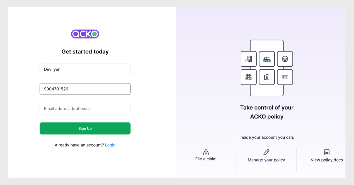
Website A
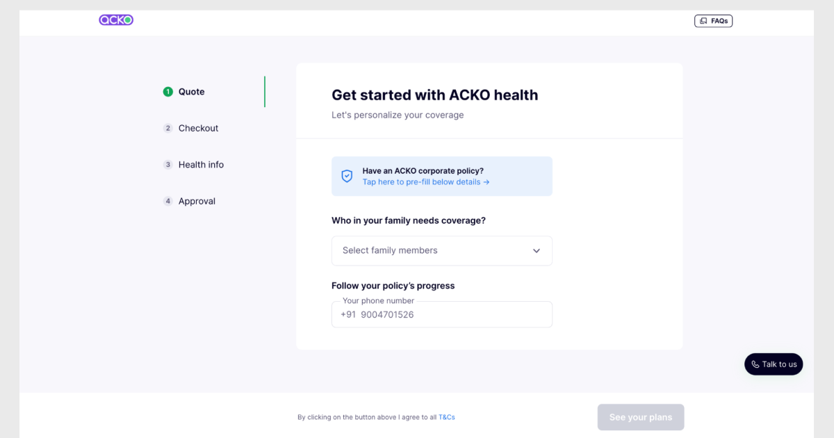
Getting Started with Acko
What’s right?
An onboarding page is susceptible to drop-offs, but not if it’s intuitive. All one has to do here is add a name and a number to sign up.
There’s even information on what users can do once they create an account. Such decision-making cues inform the user what’s in store for them and nudge them in the desired direction.
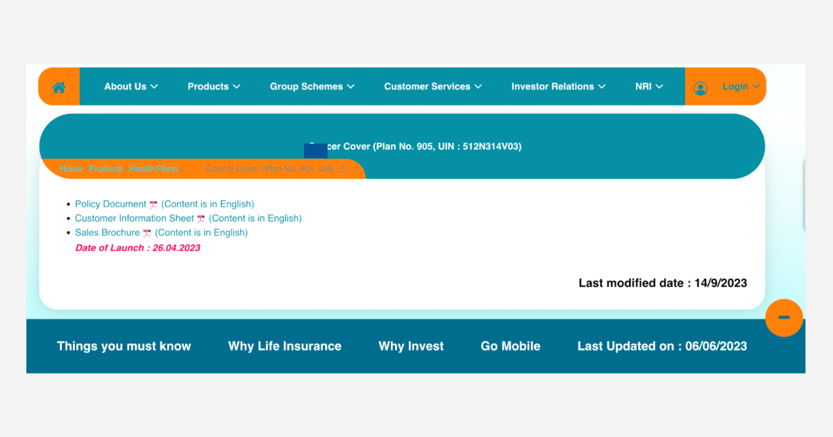
Website B
What’s wrong?
Upon clicking on Login, the website not only redirects users to a new page but a new website. This breaks the user flow and diminishes trust.
Next, it presented me with a set of fields that a user may be unable to fill. If a user wishes to choose a policy, how would they have a policy number to create an account?
Users are likely to get overwhelmed, abandon the website and take their business elsewhere when they are faced with a dilemma on a page that should be otherwise standard procedure.
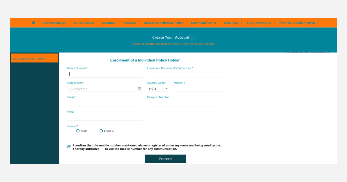
Step 3: Product Pages
After registering on your website, users will want to know more about your products and services.
Website A
What’s right?
A high-converting product page contains actionable information with a clear intent – inform users and get them to buy a policy. Anything and everything that has those two goals in mind makes for a great product page.
In the above picture, Acko presents users with a form to provide their personal information and choose the right plan. Doing so collects consensual first-party information from the users for advanced segmentation and targeting tactics.
The deeper into the website they are and the deeper into the funnel they are, the closer to conversions they are.
Website B
What’s wrong?
There are no actionable Calls-To-Action (CTA) and nowhere to proceed from this point. Users either download a brochure, read it, and then revisit the website, OR they circle back to the home page and start from square one.
Both routes are time-consuming and lead to user churn.
Between the two brands, one leads to the user buying a policy, and the other one makes them move around in circles.
If that user were you, which one would you likely choose?
There’s strength in numbers.
First-party data collected consensually from users across different touchpoints is invaluable. They reveal knowledge that you wouldn’t have otherwise known. There are a few ways to leverage your data.
Customer Data Platforms (CDP)
A CDP is a packaged software that aggregates and unifies customer data from various sources to provide a 360-degree view of a user.
This singular view of a user, powered by first-party data, shows every decision-making parameter, such as user attributes, website behavior, personal tastes and preferences, geographical location, channel reachability, and psychological tendencies, among others, on a glanceable dashboard – a single source of truth.
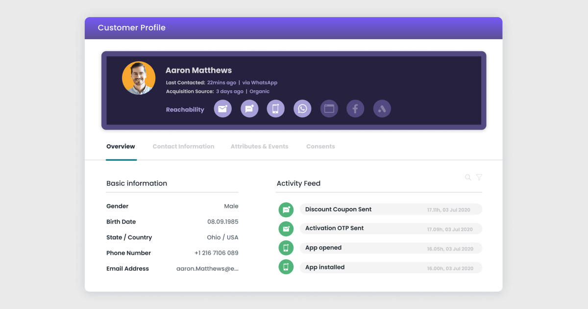
A CDP’s job is to aggregate sources of information from partner systems and show you a unified picture. On Acko’s website, travel insurance is quite popular with bus aggregators like Redbus.
When I logged into Acko’s website and viewed ‘My Policies,’ this is what I saw.
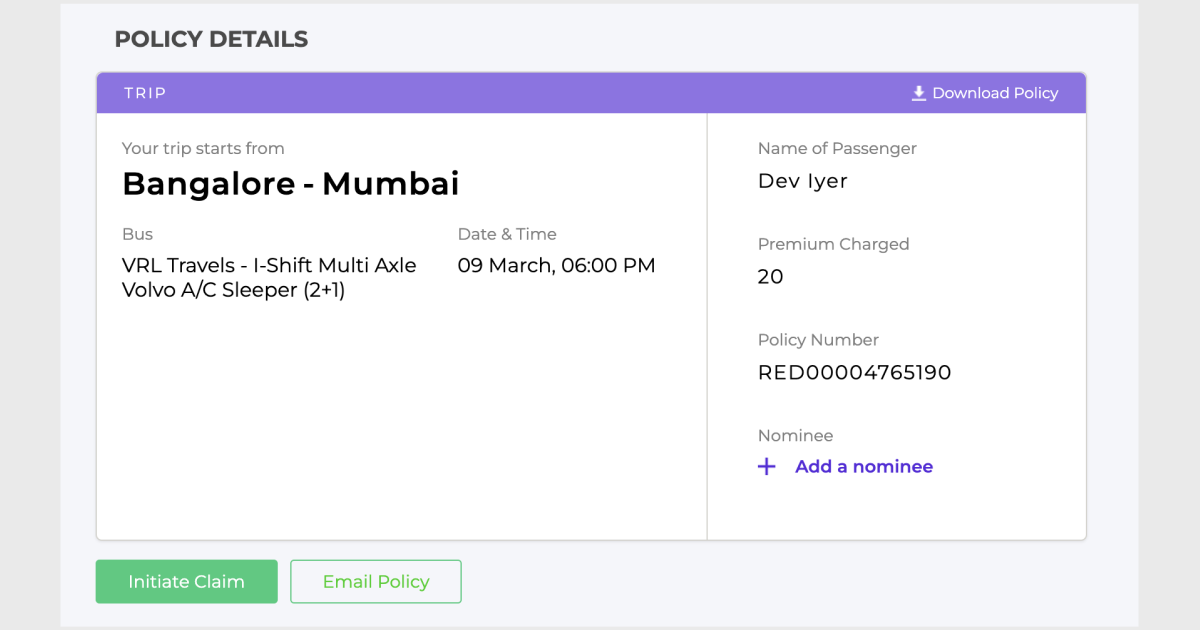
What happened here?
I booked and insured a trip on Redbus back in 2017. Acko’s CDP pulled information from Redbus’ system to show me details of that insured trip.
CDPs can also be incredible tools to harness data for hyper-personalization that will immediately level up the customer experience
Hyper-personalization
Website Personalization helps you individualize your web page for a more intimate 1:1 user experience.
Example 1
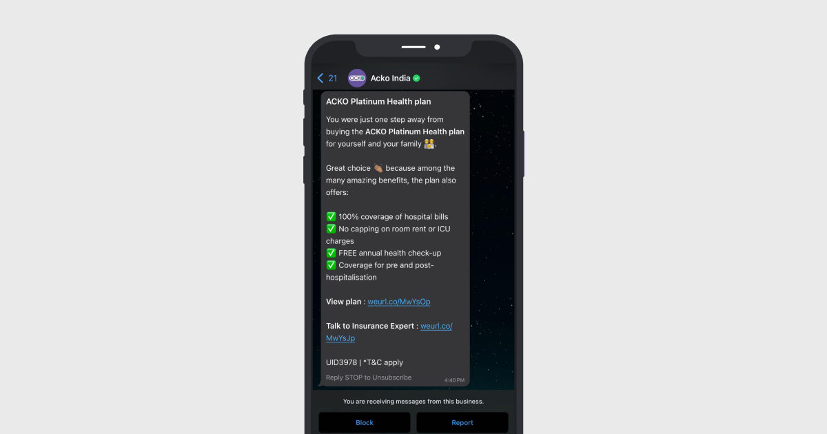
Two things happened when I keyed in my information on the website:
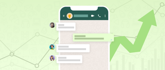
- I got a call from Acko Insurance to discuss my insurance needs. By doing so, they not only complete the circle but also lend a human touch, and a human touch majorly factors into a user’s decision-making process.
- I received a WhatsApp text nudging me to buy the plan I was exploring. This text outlined the details of the policy, along with CTAs for the next steps.
Example 2
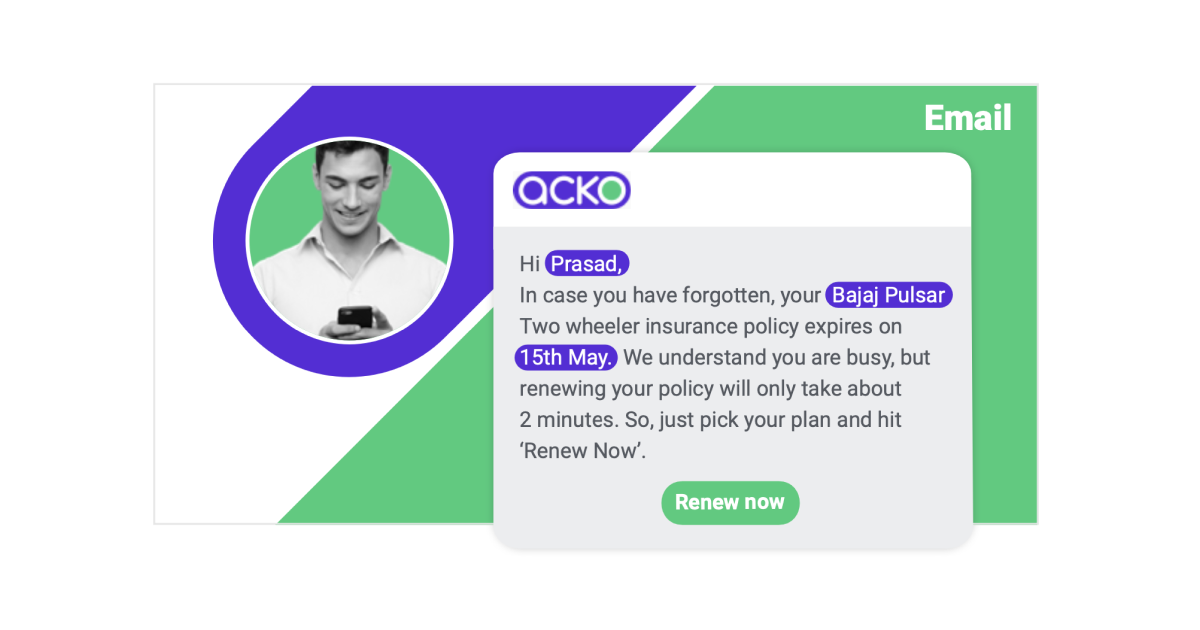
In the above example, Acko reminds a user to renew a bike insurance plan that is about to expire soon.
Another popular use case of hyper-personalization is the catalog & recommendation engine.
Catalog & Recommendation Engine
A catalog keeps all your product information up-to-date and helps you send relevant, personalized communications. For example, you can fetch the updated price information for a product from an uploaded Catalog and ensure you never send stale or incorrect data in your messages.
Recommendation Engine personalizes your communication with recommendations based on your users’ actions or events.
What could insurance companies be doing with this feature?
If a user purchases life insurance for themselves, they can use a recommendation engine to suggest other policies that the user might be interested in purchasing.
In closing,
Dissecting your funnel to know which pages of your website are doing well and which ones aren’t will tell you where to optimize your conversion rate.
Out of 100 users, a top-performing website would get 80-90 users to fill out a quote form, 30-35 users to fill out an intent form, and more than 15 users to purchase a policy. A 15 percent conversion rate is a decent upgrade from a mere 3 percent.
Your website’s customer experience can be streamlined by configuring elements of your website, like
- Customized landing pages with clear Calls-To-Action (CTA),
- A pain-free onboarding process for easier sign-ups and logins,
- Detailed product pages outlining crucial decision-making information,
- Robust customer data platforms and recommendation engines for hyper-personalized experiences
- Intuitive UI/UX that supports the journey you want the user to take
With small tweaks to your website, there is a big chance to stop the leakage and boost conversions. More conversions mean a higher topline, and a higher topline means a greater market share.
Optimizing CRO is just the tip of the user engagement iceberg. There’s a world of possibilities for exponentially increasing your conversions, but that road is often overwhelming and might need some hand-holding.
At WebEngage, our marketing pundits help you navigate the smaller challenges that open doors to bigger rewards. Our homegrown state-of-the-art marketing automation platform has helped 800+ brands grow their business. To know how we can help you grow, book a free demo with us.

 Diksha Dwivedi
 Kasturi Patra